
I’ve been working with graphic design since around sixth grade, when I started designing my middle school newspaper in Canva before it became widely popular. That early interest grew into more advanced work in high school, where I transitioned into Adobe Illustrator through design courses at my community college. During this time, I also began exploring Adobe Photoshop and photography, expanding both my technical skills and creative perspective. At the University of Oklahoma, I continued to refine these skills, focusing on Adobe Photoshop and Adobe InDesign to create work designed not just as art, but as effective advertising.
Creativity is what drew me to advertising over marketing. I’m especially interested in how advertising blends analytical thinking with creative execution in a way that feels both strategic and intuitive to the consumer.
Logo Design
-
Adobe Illustrator
-
Adobe Photoshop
-
Adobe InDesign
I love bold, colorful, maximalist design, but I struggle to stick to one palette or style, so I created a flexible brand guide that adapts to whatever I’m making. My logo sits over my own photography, letting the visuals bring the energy while the design stays clean. Starting with the Erotique font, I customized the “A” to feel more fluid and personal, with a wave-like curve and wing shape that subtly reference seagulls and my upbringing in Washington. I’ve used seagull imagery in past work, but this version feels more subtle, adaptable, and professional.
I’ve used the Erotique font in past branding work and have loved it, so it felt right to use it here. I already had my name set in that typeface, so I started experimenting with the “A” to make it feel more like its own logo. Most of the logo actually comes from the font itself. I pulled different elements and reworked them, like using the tail of the “Y” to create the wing on the “A,” and bringing in a wave detail from one of the font variations. It was a lot of playing around and seeing what felt right while still keeping everything cohesive. The logo was built in Illustrator, and then anything with photography or mockups was done in InDesign and Photoshop, but I bounced between the platforms pretty consistently.


Logo Design
-
Adobe Illustrator
-
Adobe Photoshop
I wanted to focus on getting little girls involved in sports and came across the WTA’s Rally the World campaign, which inspired me to create my own take on the idea. The posters feature both professional athletes and very amateur young girls to show the full range of participation in tennis. My goal was to create something bold and hard to miss, designed to be plastered throughout WTA tour cities and spark interest in youth tennis. The “She Is” tagline came naturally and allowed me to fill in the blank with aspirational words that reflect the current dominance of professionals and the future of women’s tennis.
Most of the work was done in Photoshop. I used the existing WTA color palette to my advantage, adjusting the script text and the athletes’ clothing to match the brand colors. Much of the dimension comes from drop shadows and the foil background, which uses 2–4 layered effects with additional “She Is” text masked into the background. The final touch was the signatures. For the professional players I sourced their real signatures online, and for the kids I hand drew them and refined them in Illustrator.
Social Media Campaign
-
Adobe Photoshop
While exploring brands for this assignment, I came across Ariat’s April Fools’ Day campaign featuring Thomas Lennon as Lieutenant Jim Dangle from Reno 911. As a fan of the show, and someone who’s been dreaming of owning cowboy boots for country concerts, I knew this would be a fun and fitting campaign to work with. Ariat had only shared the video and a few stills from the photoshoot, so I saw an opportunity to build on the concept by turning the content into engaging social media ads with added text.
The designs themselves were relatively simple to create. I cut out Jim Dangle from the original photos and placed him on a solid background to serve as the new backdrop. From there, I added text and layered everything appropriately to maintain visual balance. I used white text with drop shadows to ensure readability against the lighter background, also drawing in some drop shadows around Dangle himself. The mockups also include actual captions and engagement metrics pulled from the original posts to enhance realism.


Movie Poster
-
Adobe Illustrator
-
Adobe Photoshop
I had so much fun working on this project! The idea was inspired by the song Homewrecker by Willow Avalon, which some consider the other side of Dolly Parton’s Jolene, hence the name. I originally wanted to take inspiration from Wes Anderson movies, and found myself looking at the asteroid city cover plenty. I then saw some neon signs like the Betty Boots store in Nashville, TN. I thought this concept could make a cool movie poster, and developed it, keeping some country elements, and using some Dolly Parton lore in the credits.
I based my illustration on the Betty Boots sign, recreating it using Illustrator’s Pen Tool and modifying certain elements to better align with the theme of the movie. After completing the base illustration, I copied it as a layer into Photoshop and applied a variety of effects to each line to simulate a realistic neon sign. For the background, I placed the sign against a brick wall and used a freeform gradient created in Illustrator to mimic the glow. Finally, I added a few dust textures using the difference blending mode to give the piece a slightly worn, rustic look like something you would expect to see on the wall of a bar.
Print Campaign
-
Adobe Photoshop
Coming up with ideas for Liquid Death was just as fun as the brand itself. I wanted to highlight the juxtaposition of Liquid Death’s intense aesthetic with the simple truth that it is just water. After seeing some existing examples that featured the phrase “Don’t be scared, it’s just water,” I felt inspired to build on that concept. I thought it would be intriguing to take common fears and reimagine them in a way that would grab attention while still tying back to the product’s core message. The bus stop ad ended up being my favorite (and the most time-consuming). The flavor “Squeezed to Death” instantly made me think of a snake constricting its prey, so I leaned into that concept for a visual that I am proud of.
All cans and logos were sourced directly from the Liquid Death website. The snake originally wrapped around a rock, but with some Photoshop magic (the clone stamp, dodge and burn tools), I transformed it to wrap around the can itself. I used the same concept for the billboard, but I also wanted to include spiders. Unfortunately, I was never quite satisfied with how they turned out. For both of these ads, I added a gold texture to the letters to give it more of a 3D feel. For the newspaper ad, I wrote the copy, placed it along with the logos on the headstone, and experimented with effects until it looked convincingly engraved.


Anything & Everything

Poster
Challenged to use only lines and 1 color (along with black and white) to make a poster for a piece of classical music.

Poster
For ART 120 @ Green River College; prompted to make a poster that takes a stand.

Poster
For ART 120 @ Green River College; prompted to make a poster only using text. For a hypothetical Seattle Kraken Game 7.

Graphic
For ART 110 @ Green River College. Recreated an image in Illustrator for the Transparency and Depth Assignment.

Poster
Made as a birthday gift for my friend.
Graphic
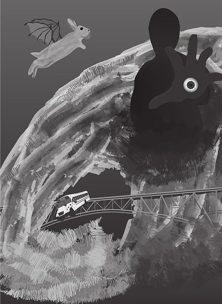
For ART 109 @ Green River College (an intro to Illustrator class); prompted to design something based on "dreams."

Playing Card
For ART 110 @ Green River College; prompted to design something based on the word "home"

Photography Experiment
For an intermediate photography class @ Green River College. No prompt, just something I decided to mess around with.

Album Cover
For ART 120 @ Green River College; prompted to design an album cover. I chose a song by the Greek artist good job nicky.


Various Print & Digital Promotional Materials
Made as the Marketing Coordinator for a small business in Auburn, WA: Gotcha! Arenas.